Shoreline Realty Partners Branding & Design
Murphy Empire partnered with Shoreline Realty Partners to develop a refined brand identity that positions the firm with clarity, trust, and professional presence. We crafted a new logo, complementary marks, a versatile color palette, and print and digital-ready stationery — all designed for consistent use across web and promotional materials.
(Scroll to bottom for continued project description and details)

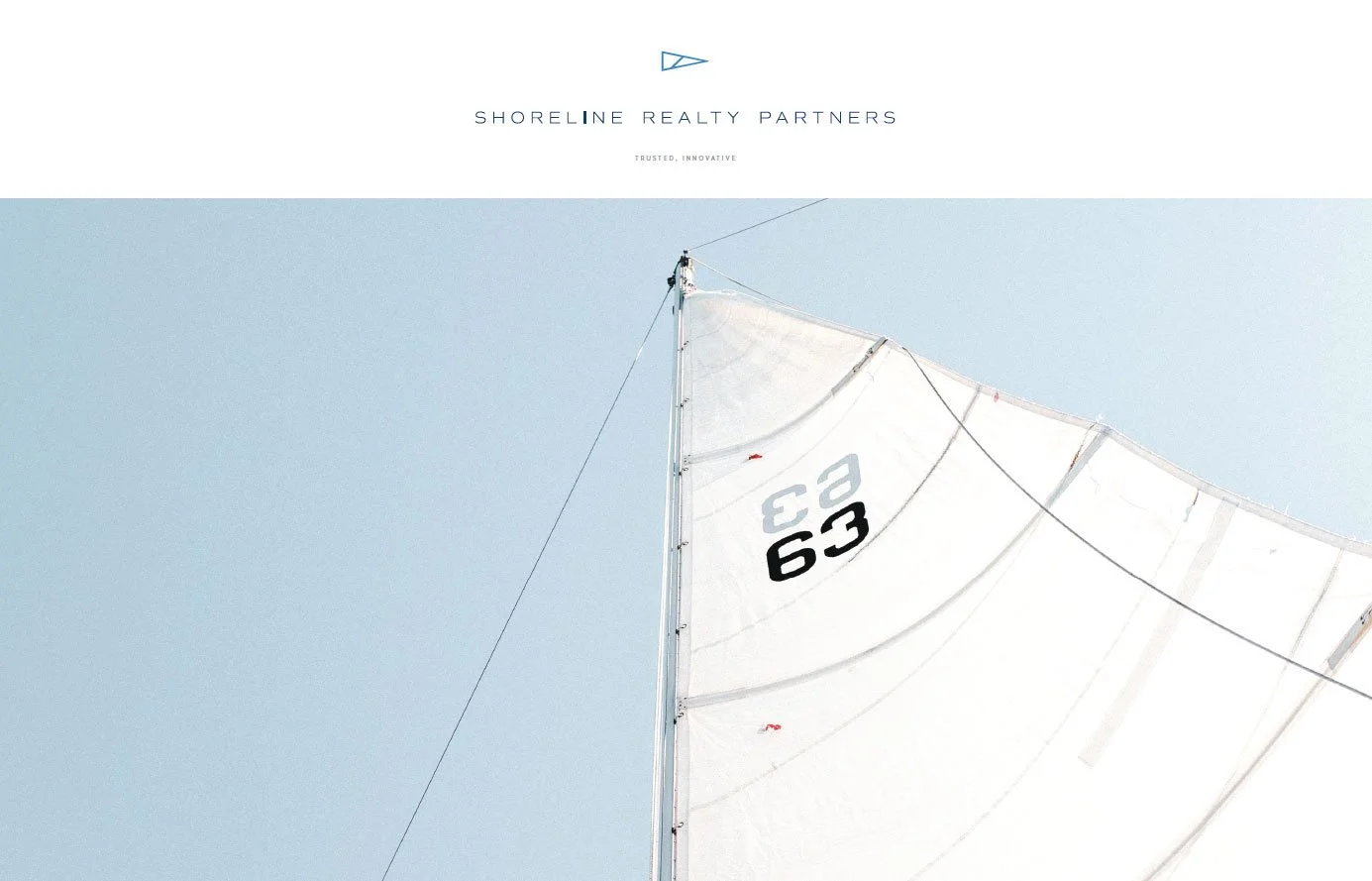
Brand Identity & Creative Direction
Our branding and creative direction centered on communicating both approachability and expertise. We built a cohesive visual identity system that reflects Shoreline Realty Partners’ commitment to community and real-estate service, balancing clean design with authority. Every element from typography to color to layout supports a unified brand voice.
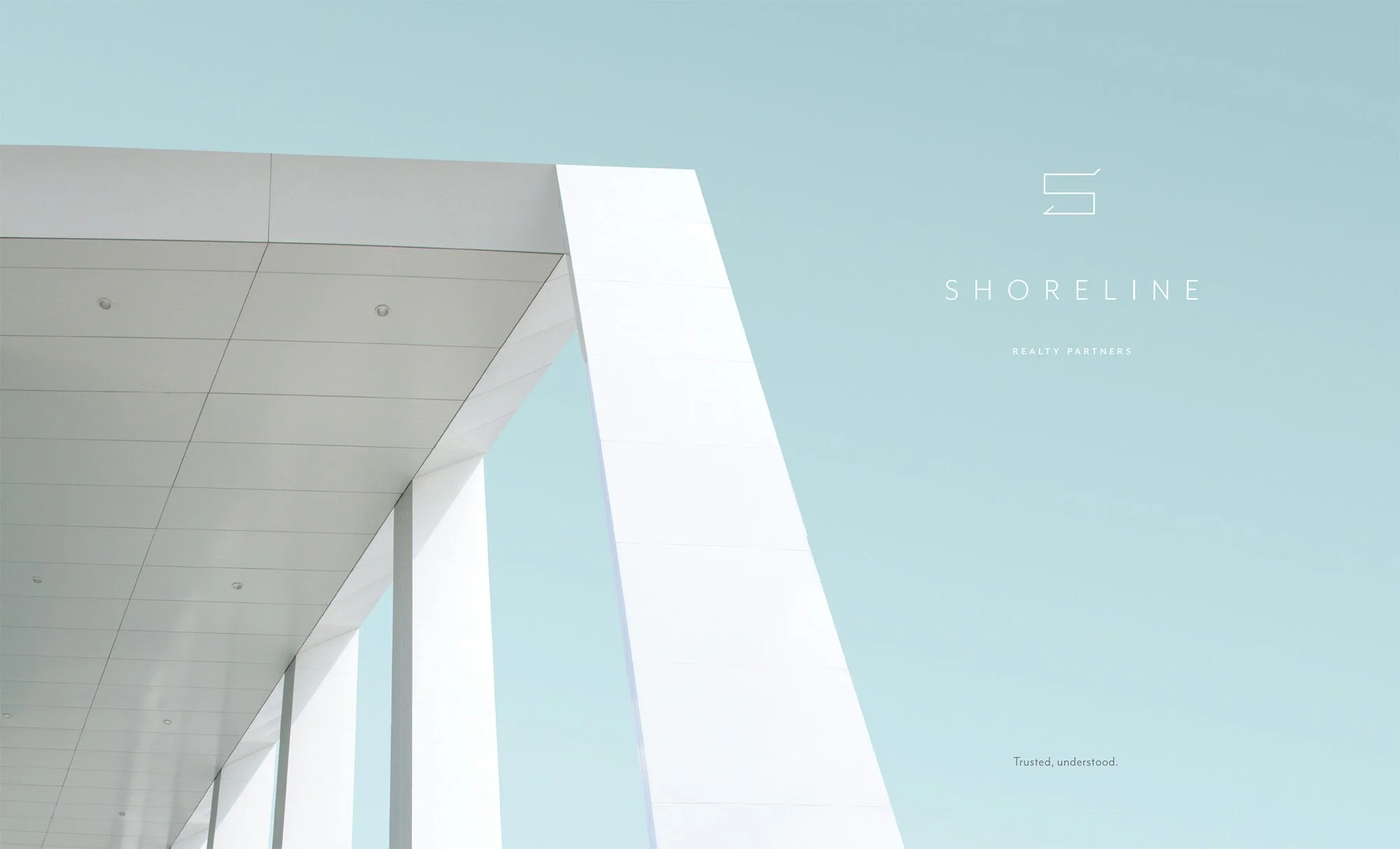
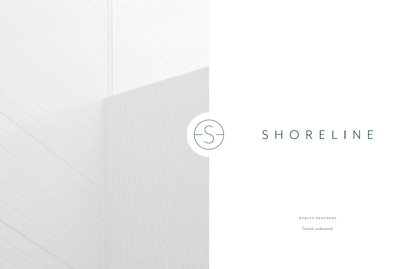
Logo Design & Visual Language
The logo design features a strong yet welcoming mark, crafted to communicate reliability and modernity. Supporting visual language — including secondary marks, a flexible color palette, and defined typography — ensures the brand identity works cleanly across digital and print applications from business cards to web headers.
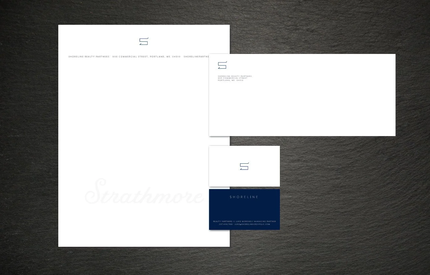
Print & Digital Stationery & Collateral
We translated the brand identity into a full suite of stationery and promotional assets: letterhead, business cards, email headers, and web visuals. Each piece was designed with consistency, readability, and brand reinforcement in mind — making sure every touchpoint across both web and print carries the brand’s clarity and professional tone.
Deliverables
Brand Strategy & Visual Identity System
Logo & Supporting Marks
Color Palette & Typography System
Print & Digital Stationery (web headers, business cards, email templates)