Why Most Logos Fail — And What Custom Typography Actually Solves
When clients come to us with an idea for a logo, they often say something like:
“I think I’ve found the font I want.”
That instinct makes sense. Typefaces are everywhere. They feel accessible. They feel concrete. And at a glance, many logos appear to be “just type.”
But here’s the truth:
A logo is not a font. And treating it like one is one of the most common ways brands lose distinction before they ever begin.
Fonts Are Tools. Logos Are Constructions.
A font is a system. It’s designed to work across hundreds or thousands of characters, sizes, and contexts. It needs to be flexible, consistent, and neutral enough to serve many purposes.
A logo is the opposite.
A logo is a single, highly specific construction. It exists to represent one entity, one voice, one personality. It is drawn, refined, adjusted, and tested to work in exactly the way that brand needs it to work.
When a logo relies solely on an off-the-shelf font, it inherits every limitation of that font:
The spacing wasn’t designed for that exact word
The proportions weren’t drawn for that specific rhythm
The letterforms weren’t shaped to express that brand’s character
What you end up with might look “fine,” but fine is not the same as distinctive.
Typography Is Where Meaning Lives
Typography is not decoration. It is structure, tone, and intent.
The curve of an “S,” the weight of a stem, the tension between letters, the way characters sit next to each other — these details communicate far more than most people realize.
Two logos can use similar words, similar colors, even similar industries, yet feel entirely different because of typographic decisions alone.
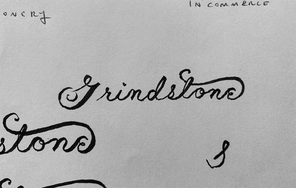
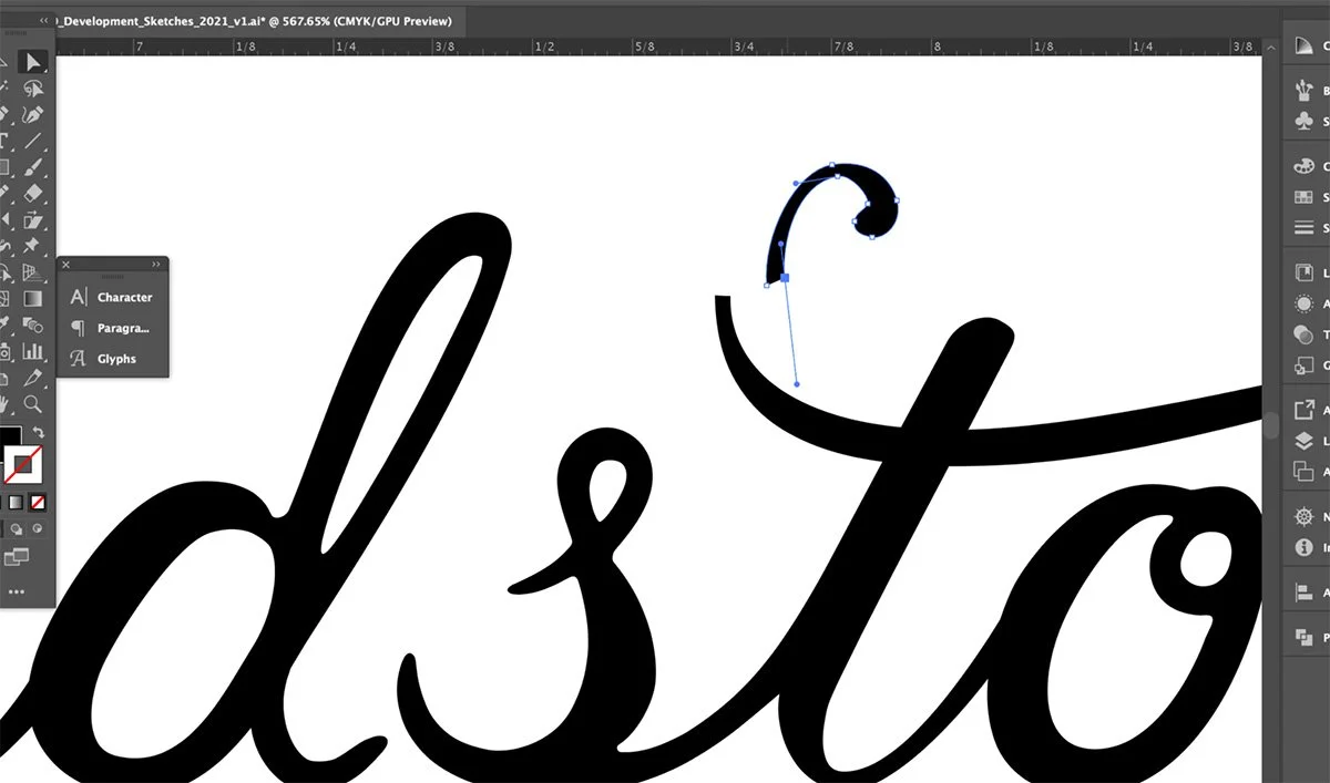
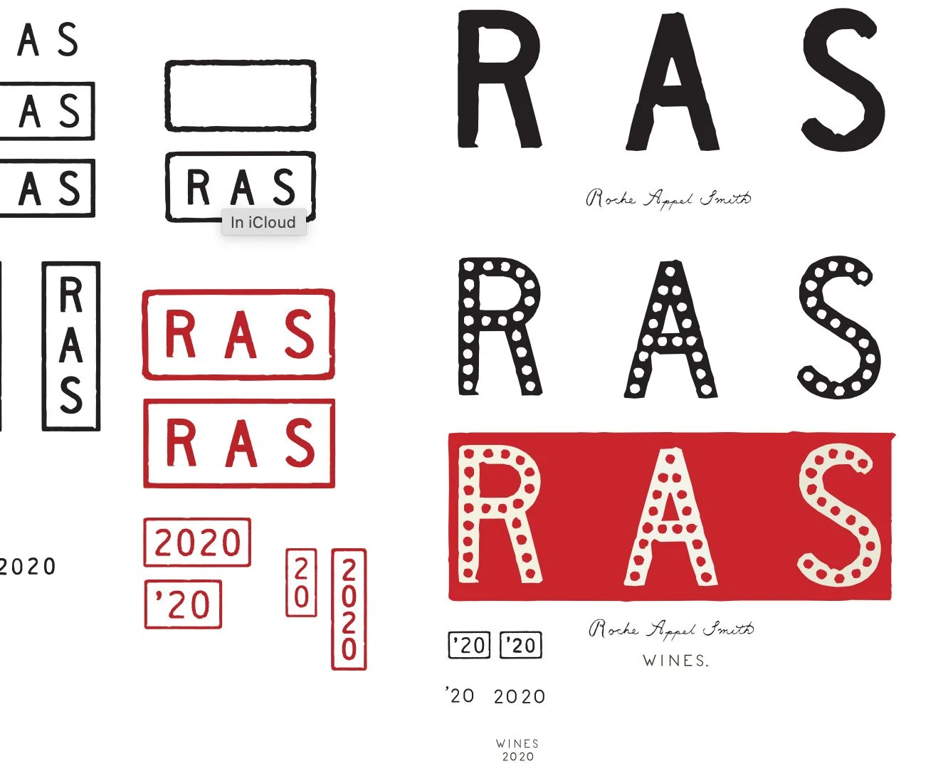
That’s why serious logo design almost always involves custom typographic refinement, even when it starts from an existing typeface.
Letters are adjusted.
Spacing is redrawn.
Shapes are refined.
Relationships between characters are rebuilt.
At that point, you are no longer “choosing a font.” You are designing a mark.
Why Custom Letterforms Matter
Custom typography does a few critical things for a brand:
1. It Creates Ownership
No one else can legally or visually replicate your exact letterforms. That alone is a powerful differentiator in crowded markets.
2. It Improves Legibility
Custom spacing and proportions ensure your logo works at small sizes, on screens, in print, and in motion.
3. It Carries Personality
Subtle adjustments can make a mark feel confident, restrained, expressive, timeless, modern, or quietly authoritative.
4. It Future-Proofs the Brand
Trends change quickly. Fonts fall in and out of favor. Custom typography ages far more gracefully.
Why This Gets Overlooked So Often
Most people don’t see typography the way designers do, and that’s not a flaw. It’s simply unfamiliar territory.
Fonts are marketed as finished solutions. Logo generators reinforce the idea that branding is a quick decision rather than a considered process. And many design tools make it easy to stop too early.
But the brands that endure almost never do.
They invest in nuance.
They invest in craft.
They invest in decisions that aren’t obvious, but are deeply felt.
What We Do Differently
At Murphy Empire, typography is never an afterthought.
We approach logo design as a typographic problem to be solved, not a font to be selected. Every identity we create involves:
Careful typographic study
Custom letterform refinement
Intentional spacing and proportion
A focus on how the mark performs across real-world applications
Often, the most important work happens in the smallest adjustments. Those refinements are invisible to most people, but they are exactly what make a brand feel confident, considered, and unmistakably itself.
The Takeaway
If you’re building a brand, or revisiting one, remember this:
Your logo is not a font.
It’s a voice.
It’s a signal.
It’s often the first thing people encounter, and the thing they remember longest.
When it’s crafted with intention, it doesn’t just identify a business. It communicates belief, clarity, and care. And that difference is felt immediately, even if it’s hard to explain why.
If you’d like to explore how typography shapes identity, you can learn more about our approach to logo design and brand identity development, or start a conversation about your project when you’re ready.
Ken Murphy is the founder and senior designer of Murphy Empire, a Portland, Maine branding studio specializing in brand identity systems, typography, website design, and AIO-informed SEO.


