Portland Museum of Art
Identity Architecture in Practice
Murphy partnered with the Portland Museum of Art to develop a refined identity system for one of New England’s leading cultural institutions.
The work focused on creating a typographic and symbolic framework capable of supporting exhibitions, institutional communications, and visitor experiences while maintaining clarity and recognition across both physical and digital environments over time.
The resulting identity system balances architectural restraint with contemporary cultural presence, reinforcing the museum’s role as a civic and artistic landmark.
Client
Portland Museum of Art
Sector
Cultural Institution
Location
Portland, Maine
Scope
Identity System, Typography, Environmental Graphics, Institutional Communications
Institutional Context
The Portland Museum of Art is one of New England’s leading cultural institutions, serving as a civic and artistic anchor for the region.
The identity system was designed to support the museum’s evolving exhibitions, educational programs, and public engagement while maintaining visual coherence across a wide range of institutional communications.
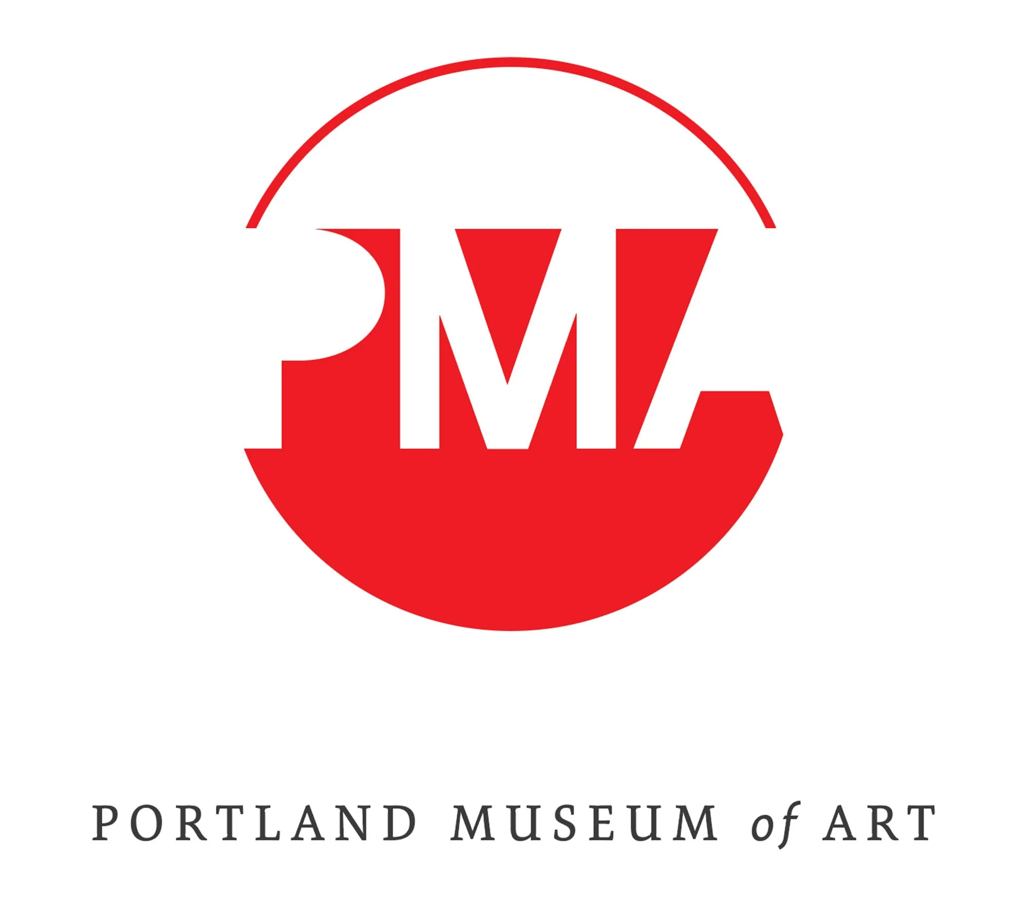
Identity System
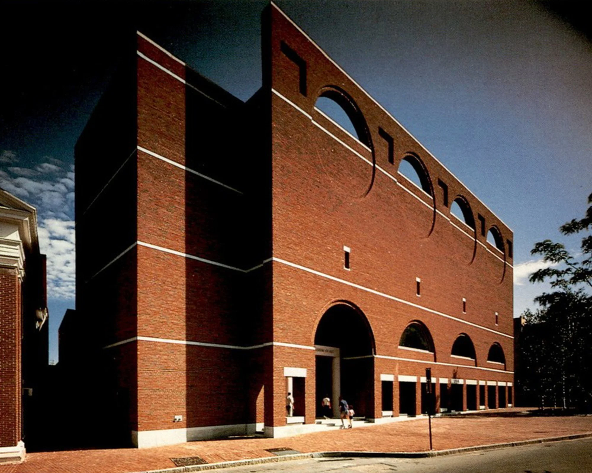
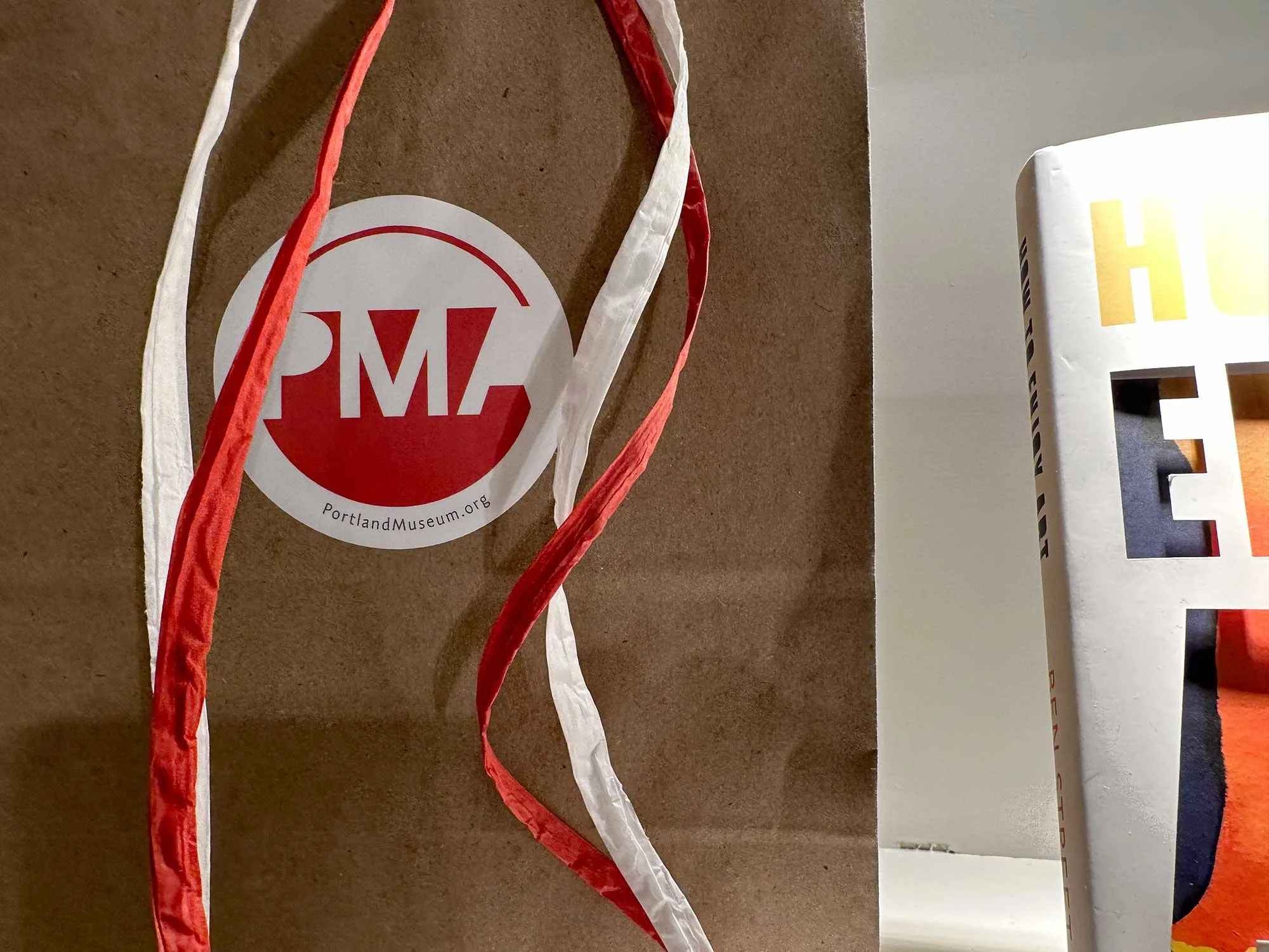
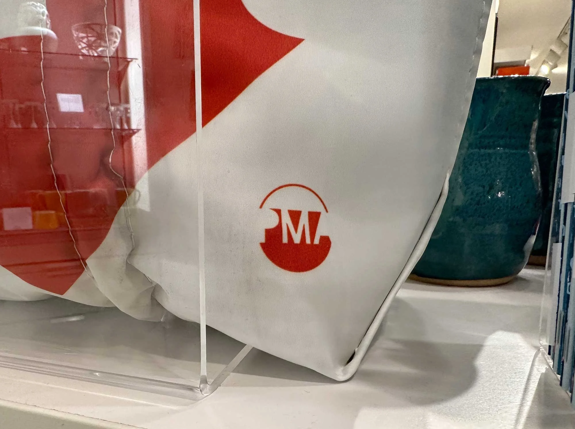
The primary mark draws from the circular architectural forms that crown the façade of the Payson Building. By translating this structural element into a modern graphic symbol, the identity becomes both site-specific and timeless.
Typography, color, and layout were developed as a unified system capable of supporting exhibitions, membership programs, publications, and digital platforms while maintaining clarity and consistency.
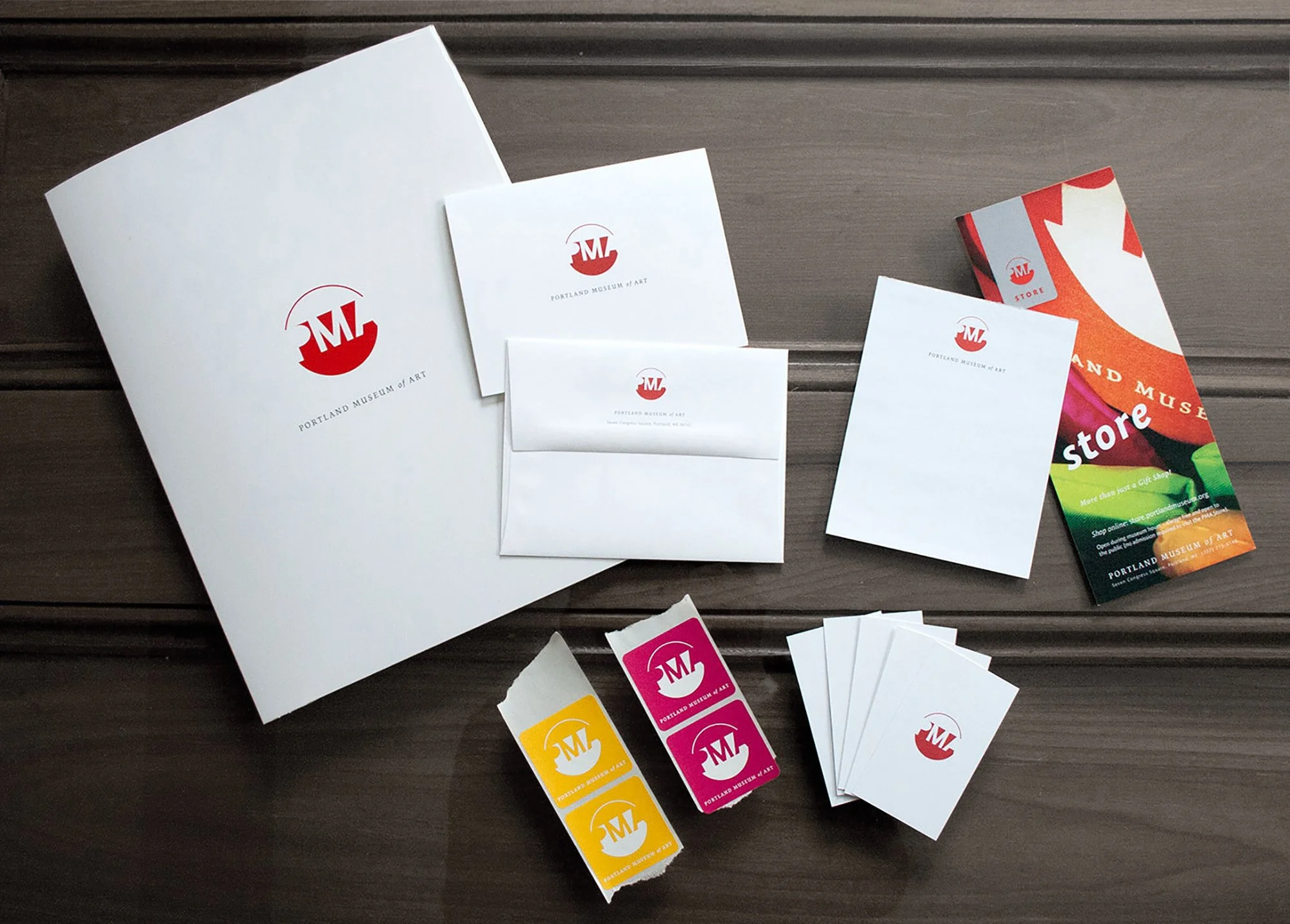
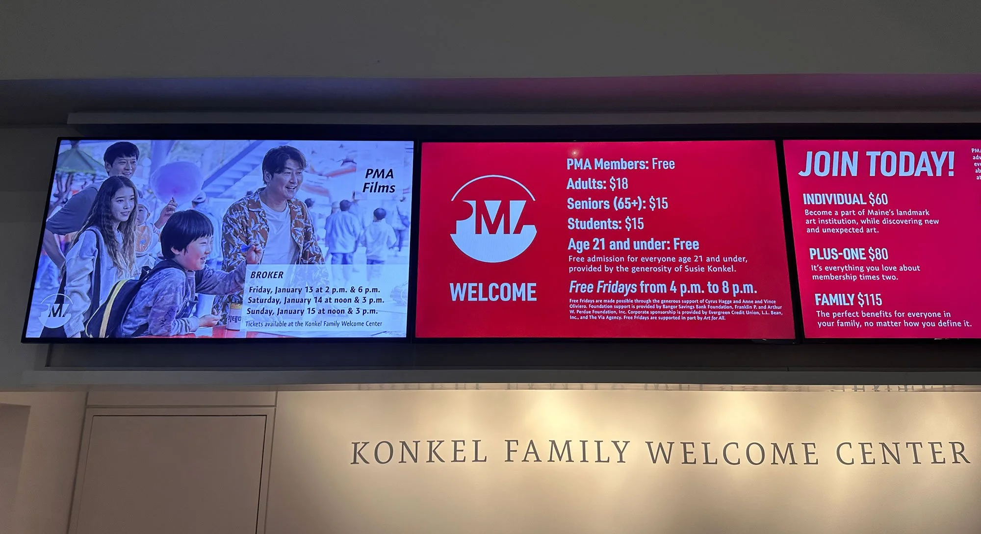
Applications
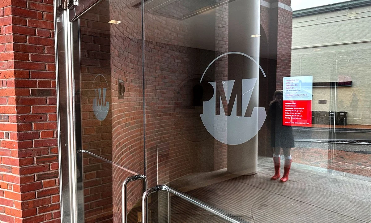
The identity extends across environmental signage, visitor materials, exhibition communications, and digital environments. Each application reinforces a coherent visual language that connects architecture, institution, and audience.
Together these elements create an identity system designed to remain legible, recognizable, and adaptable over time.
This project demonstrates how Identity Architecture creates clarity, recognition, and institutional continuity across physical and digital environments.